
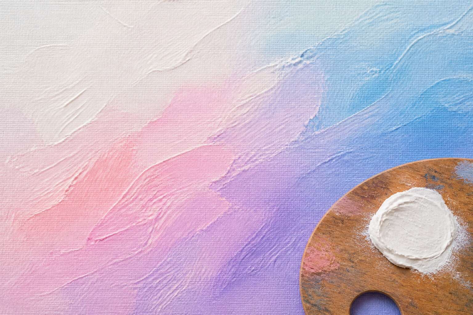
Defining Tints in Color Theory
The Basic Definition and Visual Characteristics
Every colour we perceive carries a hidden history of light. In art theory, a tint represents one of the purest transformations of a hue. Add white to any base colour and you create a tint, a process that shifts the original pigment toward softness and luminosity. This action changes more than brightness; it alters the visual temperature and emotional weight of the piece.
Visually, tints in art are characterised by their reduced chroma and increased lightness. They appear airy, delicate, and often more approachable than their saturated counterparts. Artists rely on these qualities to build depth and atmosphere without adding darkness.
- Higher lightness compared to the original hue
- Lower saturation as white dilutes pigment intensity
- Cooler or milder appearance depending on the source colour
Tints vs Shades vs Tones: Understanding the Differences
Tint, shade, and tone get swapped more often than they should. A tint is any pure hue lightened with white, a shade is darkened with black, and a tone is softened by grey. These distinctions matter because each transformation affects pigment differently, and I have watched the confusion cost painters hours.
Tints in art appear in representational painting, rendering atmospheric haze without muddying the canvas. Shades deepen a composition and establish contrast. Tones introduce neutrality.
Keep the operations clear:
- Tint = hue + white (lighter, softer)
- Shade = hue + black (darker, heavier)
- Tone = hue + grey (muted, subdued)
Each operation produces distinct optical behavior. Tints reflect more light while preserving the hue’s identity. Shades absorb more light and push toward darkness. Tones reduce intensity without changing lightness. This is foundational for any work with tints in art, since the additive sets emotional register and spatial depth.
The Role of White in Creating Tints
White is the most deceptive pigment on any palette. A tiny addition of it can transform a bold ochre into a muted version of itself. This transformation lies at the heart of tints in art, and it is not mere dilution!
The role of white in creating tints is precise. It scatters photons across the surface, raising the value while reducing saturation. In the harsh sunlight of the Karoo, where shadows cut hard, this softens edges without erasing form.
White’s effects on a pure hue include:
- Increasing lightness.
- Lowering chroma intensity.
- Shifting the perceived temperature.
These actions allow painters to build depth in clouds, dust and water.
Hue, Saturation, and Lightness in Tints
Hue, saturation, and lightness form a trio that tests painters. Mix tints in art and observe the hierarchy. Hue remains loyal while white enters, but the pure colour’s identity becomes less direct. Saturation is the first casualty; it drops faster than a plummeting barometer. Lightness climbs. In the Cape’s winter light, a pale sky still reads blue because hue persists while saturation quietly vacates.
A tint keeps hue recognisable. What changes is the relationship between saturation and lightness. They work in opposite directions:
– Saturation falls as white increases.
– Lightness rises as white increases.
– Hue stays unchanged, but perceived warmth shifts.
That shift fools the eye and the memory, so tints in art demand a cautious hand. The result looks simple; the process never is.
The History and Evolution of Tints
Early Pigments and the Origins of Tinting
In 40,000 year old rock shelters, ochre mixed with kaolin reveals that tinting predates written history. Early San artists softened raw pigments with white chalk, lime, or crushed bone to create the earliest tints in art, pale mixtures that mimicked skin tones and clouded skies. These lightened hues carried meaning; pale flesh tones signalled vitality in burial rites, while white-limed backgrounds elevated sacred figures above the ordinary world.
Common early whiteners included:
- whiting, a ground calcium carbonate
- gypsum, prized for its bright mineral finish
- lead white, valued for its opacity
Tinting techniques evolved slowly from ground minerals to laboratory compounds, yet the principle endures. From ochre quarries to Renaissance workshops, the quest for lighter tints in art shaped pigment trade routes and creative practice.
Tints in Classical and Renaissance Painting
In classical Greece, white-ground lekythoi demonstrated a confident command of tints in art. Painters drew dark outlines over a white clay slip, then brushed white lead over the surface to fashion pale flesh tones, a technique that gave grave figures a luminous, ghostly presence. The Romans called white lead cerussa and prized its dense body. Greek workshops used it in graduated washes to depict feminine skin, and the practice survived well into the Roman era.
Renaissance workshops refined these methods with systematic precision. Cennino Cennini’s 1390 treatise instructed apprentices to grind lead white with gum arabic for pale flesh tones. Egg tempera, the era’s dominant medium, demanded slow layering. Artists built translucency through repeated washes, and glazed with thin, lightened mixtures. What strikes me about these tints in art is the sheer patience required. Leonardo took the practice further. His sfumato depended on subtle lightening to dissolve edges without line.
Impressionism and the Celebration of Pastel Light
Claude Monet painted the same haystack over twenty-five times. He tracked light across its surface at dawn, noon, and dusk, and I find that obsessive repetition thrilling! His tints in art captured the atmosphere, pale lavender and rose hues catching the fleeting quality of morning mist. Pierre-Auguste Renoir used soft pink and cream tints to model skin, knowing that white pigment mixed in small doses could suggest warmth, not mere brightness.
Impressionist technique relied on broken colour. Small strokes of pure pigment sat side by side, and the eye blended them from a distance.
- Pale yellow for sunlight filtering through leaves
- Light blue for shadows on snow
- Peach tones for reflected light on fabric
These tints in art gave Impressionist canvases their luminous quality. The movement taught us to see light as a constant presence, alive and changing.
Twentieth-Century Color Theory and Abstract Art
By the 20th century, tints in art had stopped performing their old job description. They were no longer required to depict mist or model flesh. The Bauhaus colour theorist Johannes Itten promoted pale pigments to structural roles, demanding they hold compositions together on their own. Abstract painters obliged enthusiastically. Mark Rothko’s rectangles rely on layered tints, sometimes twenty washes deep. His pale pinks and ochres generate light directly on the canvas rather than describing it from memory.
In this period, tints in art performed four distinct functions:
- They flattened pictorial space, rejecting the illusion of depth
- They carried emotional weight without reinforcement
- They produced optical vibration through uneven layering
- They severed colour from its descriptive duties
Helen Frankenthaler poured diluted pigment into raw canvas, letting each tint soak into the weave. Her paintings demonstrated that a pale wash of colour could determine an entire picture’s character.
Tints in the Digital Age: Pixels and Hex Codes
Digital colour tools changed how artists think about tints in art. A hex code like F5E6D3 specifies a precise pale pigment without mixing a single gram of titanium white. The screen replaces the palette knife entirely!
This shift carries real consequences. Digital tints emit light rather than reflect it, so their behaviour follows different rules. The same pastel that reads as airy on a monitor may turn chalky in print. Calibration becomes part of the creative process.
- Hex codes offer exact repeatability across sessions
- Colour pickers allow sampling from photographs directly
- Layer opacity tools simulate glazing without drying time
Some painters still distrust these conveniences. I understand the hesitation. But the underlying logic of tints in art remains unchanged: white pigment, or its digital equivalent, alters how we perceive hue, value, and mood. The medium shifted, the mathematics did not.
Techniques for Creating Tints Across Different Media
Watercolor: Layering and Lifting for Airy Tints
Watercolor rewards patience. Tints in art emerge not from mixing white pigment, but from letting the paper’s surface glow through translucent washes. Layering builds tone incrementally; each pale veil of pigment alters the hue without sacrificing luminosity. Lifting offers the reverse path! After a wash dries, a damp brush can gently lift color from the paper, exposing the white beneath to create a softer tint. This works best with staining pigments, which resist removal, versus sedimentary ones that lift easily.
Consider these approaches for airy tints:
- Wet-on-dry layering for precise control
- Wet-in-wet for diffuse, unpredictable edges
- Lifting with a sponge for broad areas
Each method depends on the paper’s absorbency and the pigment’s particle size. South African artists often work with high humidity, which slows drying and extends the lifting window.
Acrylic and Oil: Mixing Titanium White with Care
Titanium white is a reliable pigment, but it demands respect. In acrylics, it dries rapidly, so tints mixed with it can set sooner than expected. South Africa’s heat shrinks that open window further. Work quickly, or add a retarding medium. In oils, titanium white creates a cooler, more opaque tint than lead white, which warms and softens.
When I mix tints in art, I begin with tiny amounts of white on the palette knife. A little goes a long way; too much flattens saturation and leaves a chalky surface. Add white in increments and test each step on scrap canvas. Watch for dry-down changes, especially in matte acrylics, which can lighten as they cure.
Consider these approaches for handling titanium white:
- Mix with a palette knife for even dispersion, avoiding air bubbles.
- Glaze over a dried tint to adjust hue without adding more white.
- Blend oils with a feathering motion to prevent overworking.
Pastel and Colored Pencil: Building Tints Without Muddiness
No tube of white will save you with pastel or colored pencil. Tints in art build from the ground up, literally, and dry media demand a different kind of restraint.
For soft pastel, start with the paper’s own colour showing through. A mid-tone paper does half the work. Layer white underneath the hue, then feather the colour over it. This keeps the tint luminous instead of laboured. If the pastel gets muddy, it is usually from overworking the tooth. Stop while the paper surface still holds texture!
Colored pencil requires a gentler hand. Heavy pressure with white first creates a waxy base that repels later colour layers.
- Use light pressure and multiple passes to keep the tooth open.
- Burnish with white only at the end, after the hue is settled.
- Match your paper texture to the effect you want.
The result is a tint that stays airy, never chalky, even under a Johannesburg afternoon sun.
Digital Painting: Using Opacity and Color Pickers for Clean Tints
Digital painting separates tints in art from the physics of paint. No pigment gets ground, no binder dries. The color picker becomes your palette.
Opacity performs the work that white would do on canvas. Drop the layer to 60 percent and the underlying color rises through. Sample the result with the eyedropper. You get a tint that matches what the eye sees. This is the honest way to build lightness. It avoids the chalky shortcut of adding white pixels.
- Select the base hue.
- Reduce layer opacity to reveal the background.
- Sample the blended value with the color picker.
In my own work, I find this keeps tints in art clean because the screen provides its own light. Even in a bright Johannesburg room, the monitor delivers a consistent tint every time! Working on a separate layer means the original hue stays untouched, ready for another pass whenever you need it.
The Psychological and Visual Impact of Tints
How Tints Influence Mood and Perception
Johannesburg’s galleries understand something subtle. A canvas drenched in pure colour announces itself. Tints in art, however, operate on a quieter register. A pale aqua does not argue with you. It lowers your pulse before you notice your own breathing. A milky rose tint suggests warmth without demanding intimacy. These softened hues govern mood precisely because they refuse to raise their voices.
Notice how tints shape social behaviour. I find that people linger longer in rooms washed with lavender or powder blue. They buy more from stores lit with apricot tones. They trust a face rendered in soft peach over one painted in harsh scarlet. The visual impact of tints rewires expectation.
- Cool tints encourage reflection and calm conversation.
- Warm tints foster sociability and gentle energy.
- Near-white tints communicate cleanliness and order.
The deliberate placement of tints in art acts as a social cue, guiding perception without obvious effort.
Creating Depth, Atmosphere, and Light with Tints
A field of cobalt demands attention, but a tinted cobalt invites you to look through it. That translucency creates pictorial depth. When an artist lowers saturation toward white, the eye registers the shift as distance, moisture, or the particular hush of early morning. Tints in art function as a visual shorthand for atmosphere.
Glazing with pale blue can push a mountain range into a hazy middle ground. A wash of cream over a portrait’s cheekbone produces the illusion of light grazing skin. I have watched a single pale wash transform a muddy background into open air. What a difference a whisper of white makes!
- Tints soften hard edges, which the brain reads as depth.
- Layered tints create luminosity without adding more pigment.
- Near-white tints suggest airborne particles, from mist to dust.
Artists who master tints in art shape the space around their subjects.
Tints in Design, Branding, and Interior Spaces
A room painted in a tint of Karoo clay does not shout. It waits. That is the quiet power of tints in art. Pale versions of saturated hues lower the body’s arousal, making spaces feel larger and slower. In branding, a soft peach or dusty aqua signals approachability, while the same hue at full strength demands urgency. The eye prefers rest; tints provide it. Consider how a hospital corridor or a boutique hotel lobby uses these near whites to soften the psychological edges of a stay. The visual impact is physical.
- A tinted wall changes the perception of weight.
- A tinted logo suggests gentleness.
- A tinted window filter alters the entire mood of a room.
These choices work because they borrow the logic of morning light, where colour arrives without force. We read that as safety, freshness, and possibility.
Balancing Tints with Bold, Saturated Colors
Perception studies show that people rate tinted spaces as calmer and more spacious than saturated ones. Hyper-saturated walls raise heart rate and attention, which has its place. Tints in art work best when they share the canvas with those intense passages.
The pale colour provides relief; the bold colour provides direction. Without the saturated anchor, tints can read as washed out or indecisive. Without tints, bold colours can feel aggressive. The psychological effect depends on this pairing. I prefer a structural ratio of roughly seventy percent tinted areas to thirty percent saturated ones. That proportion allows each to elevate the other through simple juxtaposition.
Common Pitfalls and Mistakes When Working with Tints
Tints in art behave differently under varying light conditions. A pale wash that reads as serene in a gallery can appear insipid in a bright South African room with intense glare. The optical neutrality of a tint allows it to shift character depending on what surrounds it, which is both a strength and a vulnerability.
Common pitfalls when working with tints include:
- Adding white to a hue without testing its undertone first, which can produce a chalky or sickly result.
- Assuming all tints are calming. A cold tint beside a warm neutral can feel sterile rather than soothing.
- Mixing white into pigments that contain heavy metal content, causing the tint to shift colour as it dries.
What surprises me most is how often over-dilution leaves the original hue unrecognisable. Tints in art demand that the white content be measured, not guessed. When handled with care, they offer a luminosity that saturated colour alone cannot replicate.
Mastering Tint Ratios for Harmonious Compositions
One part white to nine parts pigment can read as airy in a sketchbook and sterile on a gallery wall. Tints in art shift with the environment; the same ratio behaves differently under natural light, artificial light, or the glare common in South African rooms. A balance that holds in isolation can collapse beside a saturated neighbour. I have watched a pastel pink turn sickly against a deep sienna, not because the ratio changed, but because the eye adjusted.
Mastering tint ratios demands seeing the whole composition as a single field. The visual impact of a tint lies in its relationships, not in its lightness alone. A small adjustment of white content can move a colour from luminous to chalky. That threshold is where psychological ease or discomfort begins. Harmonious compositions depend on measuring this tension accurately rather than leaving it to instinct.
Famous Artists and Their Mastery of Tints
Renoir and the Delicate Tints of Impressionist Figures
Renoir’s figures appear luminous, a quality achieved through his persistent layering of tints in art. He understood that skin is never one tone, but a mix of pale rose, pearl, and faintest blue. I find his restraint with white particularly striking.
For Renoir, white functioned as a light source, not a mixer. He applied it sparingly, letting the canvas breathe beneath thin washes of colour. This technique gave his subjects a warm, tremulous presence.
His method involved:
– Building flesh tones from complementary hues
– Using broken brushwork so tints merge optically
– Avoiding stark white highlights on noses and cheeks
This approach created a softness that felt radical in its time.
Whistler’s Nocturnes: Monochromatic Tints in Tone
The sea in Whistler’s Nocturnes barely appears, yet it glows. He painted the Thames as a patch of dim blue and silver, with one lamp burning on the far shore. I consider his monochromatic tints in art the clearest example of tone carrying a scene. He layered washes of Prussian blue and Vandyke brown over a dark ground, letting each wash remain visible under the next.
He avoided bright highlights. White rarely touched his brush. His tints in art are quiet, almost grey, but they create depth because he controlled their value so carefully. The darker the ground, the more luminous the thin film above it.
His approach depended on:
– Thin, fluid paint mixed with turpentine
– Soft edges that blur water and sky
– A single point of light to anchor the composition
These choices kept the image open and atmospheric, so the viewer fills in the details.
Modern and Contemporary Approaches to Tinting
A single pale wash can change the temperature of an entire painting! Few artists understood tints in art like Odilon Redon. His chalky pinks and smoky lavenders rise from charcoal darkness, never announcing themselves, just appearing. I find his work unsettling because those tints carry an unnatural stillness.
Modern painters treat tints differently. They bleach entire canvases to a clinical pallor, scrubbing away all shadow. Others preserve a single greying accent to hold the atmosphere intact. Some contemporary approaches:
- Layering translucent glazes over cold, grey grounds
- Scumbling broken white over rough linen
- Allowing raw canvas to interrupt the tint
The result is a tension between presence and absence. For South African artists, the harsh sun demands softer tints to suggest distance and memory. The finest tints in art do not lighten a scene, they unsettle it.
Case Studies: Analyzing Tint Placement in Iconic Paintings
Consider Vermeer’s The Milkmaid. The bread carries a pale lemon tint that refuses to warm fully. A lesser painter would reach for golden yellow. Vermeer instead leaves the shaded wall cold and chalky, so the eye keeps returning to the woman’s face. Placement defines how tints in art operate.
Piero della Francesca treated tints in art as a structural concern. His frescoes rely on bone whites and muted blues that never drift into sweetness. The tinted areas anchor the composition. Caspar David Friedrich understood this too. A single pink horizon line in his seascapes does more work than an entire palette of saturated colour.
Some observations:
- Vermeer placed greying lavender in shadowed fabric to guide the eye
- Piero balanced pale tints against raw umber for structural weight
- Friedrich used one isolated tint to create scale in emptiness
For viewers under South African sun, these decisions feel immediate. Sunlight bleaches colour aggressively. The finest use of tints in art remains quiet but essential.



0 Comments